
Organisations all over the world use Excel to store and manage their data and information. Spreadsheets are vital for data management. Meanwhile, they are often inconvenient and do not provide team members with an easy-to-read view into data trends and relationships. On the other hand, Excel can assist in converting your spreadsheet data graphs to make an overview of your data and make the smartest business decisions for you. In this blog, you will get step by step guidelines for how to plot a graph in Excel.
Basically, it is an excellent tool for data recording, processing and storing. You can definitely add required data in rows and columns, calculate them easily within seconds. Undoubtedly, Excel function helps you build simple data visualisations that will please your eyes.
Table of Contents
About Microsoft Excel
Microsoft Excel is a software program built by Microsoft that uses spreadsheets to organise numbers and data with formulas and functions. Meanwhile, MS Excel is common all over the world and used by businesses of every size to perform data storing and analysis.
MS Excel is a spreadsheet program that includes the Microsoft Office suite of applications. With the help of Office 365, you will be able to download the application to your hard drive and will also have access to the online version of it. Meanwhile, The online version gives you the capability to share and collaborate with others on your document.
Where can you use MS Excel?
You can use Excel and solve your purposes. It can be utilised by given below:
You can see a lot more uses of MS Excel. But above, we have mentioned a few.
Now, let’s have a look at its areas of use:
- Excel is basically used for data entry and storage
- Collection and verification of your business data and information
- Administrative and managerial purposes
- Accounting, budgeting and other financial works
- Data analysis
- Reporting and visualizing data
- Forecasting purpose
Why are charts and graphs Important?
A chart is a useful tool you can use in MS Excel to interact with your data graphically. Charts and graphs both simplify information and make it easy to understand. There is a saying that, “A good picture is worth a thousand numbers”.
Similarly, charts help your audience to find the meaning hidden behind the numbers. In this lesson, you will learn how to insert charts and modify them so they communicate information effectively. Hopefully, you will know how to plot a comparison graph in Excel from this blog. Charting in Excel is an important skill for visualizing data and understanding it better. It is often used for study or for work. For those who also work with texts and want to make sure of their quality, there is also an option for this, for example https://textero.io/essay-checker will help to quickly check essays for errors and improve the structure.

Are graphs and charts the same?
Graphs are typically different from charts. Charts present a large set of information in the form of graphs, diagrams or tables. However, Graphs present the mathematical relationship between sets of data.
Though graphs are one type of chart, it is not the only type of it. In other words, all graphs are charts but, not all charts are graphs. Usually, in MS Excel, people consider all graphs under the chart categories, and you can use the terms interchangeably.
Various types of Graphs available in Excel
Below are some demonstrations of different types of graphs you can use on your excel document:
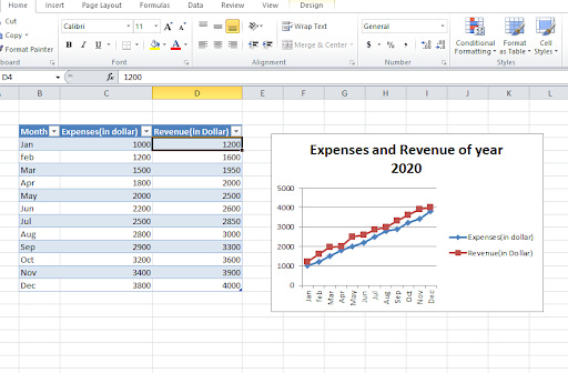
Line Graphs
Both 2D and 3D line graphs are available in Ms Excel. Nowadays, Line graphs are popular for showing trends over time. At the same time, plot more than one data parameter. For instance, employee compensation, the average number of hours worked in a month and the average number of annual absences of workers against the same X-axis or time. You can see a line graph below-
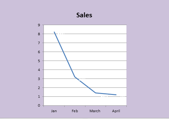
In a line graph, You should use it when you chart a continuous data set. You can design line graphs in various colours and styles. In this blog, You will learn how to plot a line graph in Excel.
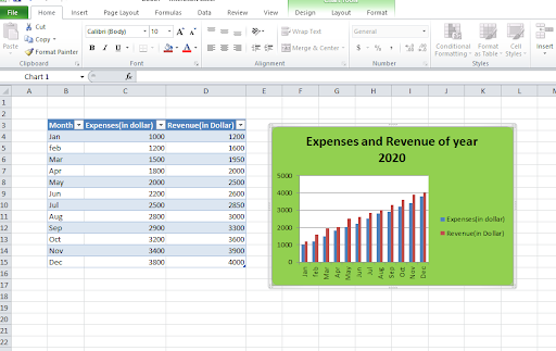
Column Graphs
Column graphs help people to see how the parameters of comparisons of items or change over time. However, they are known as “graphs” when only a single data parameter is used. If more than two parameters are called into action, the audience can not really get any insights about how each individual parameter has changed. A Column graph is given below:
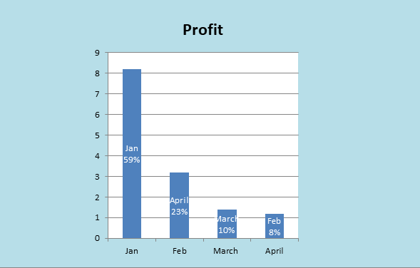
By using column graphs, you can see the average numbers of hours worked in a week and the average number of annual leaves when plotted, side by side which do not provide the same clarity as the Line graph.
Bar Graphs
Bar graphs have similarities to column graphs but, a bar graph is basically a horizontal column chart that must be used to keep away cluttering when one data label is long or if you have more than 9-10 items to compare.

You can see a bar graph in the above picture. This type of graph can also be used to present negative numbers. You can customize the bar style and colour for a better look.
Pie Chart
Pie charts are very popular. A pie chart shows how items represent part of a whole thing or the composition of something. See a pie graph below:

A pie chart displays numbers in percentages, and the total sum of the whole segment needs to equal a hundred percent (100%). Surely, Pie charts are visually aesthetic and easy to understand for their viewers.
Area Chart
An area chart is actually a line chart, while the space between the x-axis and the line is filled with a colour or pattern.
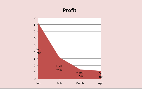
It is useful for showing part of whole thing relations, such as showing individual revenue contribution to total revenue for a year. Moreover, It assists you to calculate both overall and individual trend information. You can easily create graphs using graphing calculators.
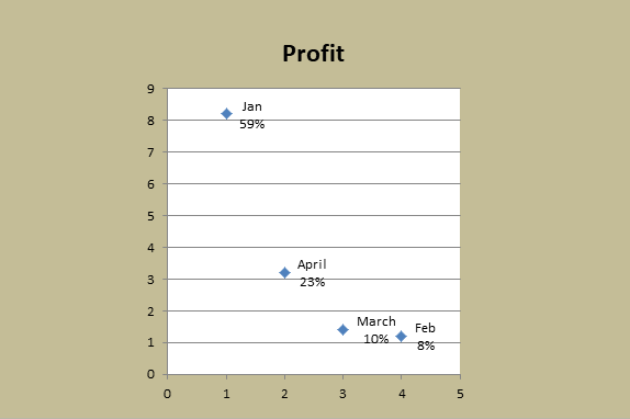
Scatter Plot
The scatter plot or scatter chart will show the relationship between two different variables. Look at the scatter plot graph below:
You can use it when there are many data points, and you want to focus on similarities in the data set. Also, this is helpful when you are looking for outliers or for understanding the distribution of your data.
How to Plot a Graph in Excel (step-by-step Instruction)
Let’s have a look at how to plot a graph in Excel with some easy steps:
STEP 1: Specify the units of measurement
Most importantly, you may question, how to plot a XY graph in Excel? The first step for you is to input your data points. For doing that, you have to label the axes:
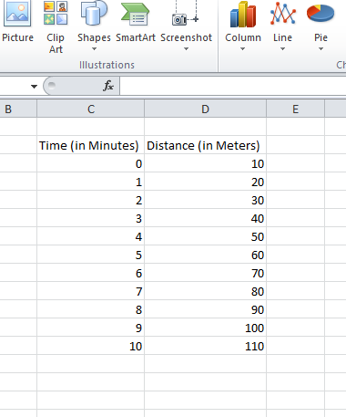
- Firstly, let’s take the X-axis as “time” (for a unit you can take minutes) and the Y-axis as “distance” (with the units meter).
- Write Time and Distance in two alongside cells.
- Or you can add Year in one axis and profit or sales in another axis if you want to see the graph of profit or sales over the years.
STEP 2: Enter your data into Excel sheet
Click on the cell and enter your first value; take the time 0 and increase the time by one minute until you reach 10.
Now, Input first data value for distance as 10 and increase distance by 10 meters each minute.
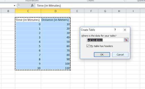
STEP 3: Make a data table
In MS Excel you will find “toolbar” located at the top of the page and the grid is at the bottom:
- Select the cells that contain your information for the table.
- Click the “Insert” tab and locate the “Tables” group.
- To continue, tap to “Table” option. A “Create Table” dialogue box will open.
- In the column heading, check the box “My table has headers”.
- Verify if the range is correct and, then click [OK].
- Change and reshape your columns to make the headings visible.
- Click on a cell in the table and activate the “Table Tools” option.
- Now, tap the “Design” tab and locate the “Table Styles” group.
- Select a style/colour option that you prefer.
Now, you have your table.
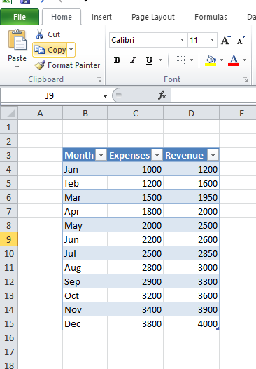
You can choose more than two data series. For instance, Months of operation and both revenue and sales simultaneously.
STEP 4: Choose the best graph and chart options that suit your operation
In Excel, you have huge ranges of choice for charts and graphs to create. This includes column chart, line chart, pie chart, area chart, scatter plot, (Stock, Surface, Radar, Bubble Doughnut etc.) charts. Obviously, you can choose any chart and graph as you desire.
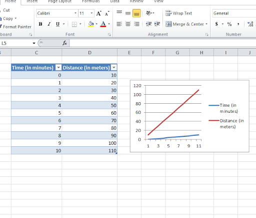
STEP 5: Select your data table and insert your desired graph
Now to make your chart, you have to select all the data you created by clicking and dragging all of your data points. Then, you have to go up to the insert tab and click that. And scroll over to your preferable graph choice. You will find options like column, line, pie, bar area and many more chart options. Select one which best presents your data. At the corner of the chart box will see an option “create chart”. Tap the option for customizing your chart.
STEP 6: Add a proper chart title
Adding a chart title is a must. Click the chart, and then click the layout option. Click “Chart Title”. After that, click the title option that you want. Then, write the title in the Chart Title box. To format the headings, select the text in the title box. And then on the Home tab. Select the formatting style that you want. You can position the chart title above, below or any side of the graph.
STEP 7: Adjust your data layout and colours
Select the layout which you like the best as it gives your axes titles as well as your chart title. Conveniently, you can also use a wide range of colours for your graph.
Step 8: Change the size of your chart's legend and axis labels
For better presentation of your graph, resize your charts legends and axis labels like below:
Step 9: Edit your data, if necessary
Last but not least, if you edit your data, the graph will automatically change with it. You can delete or add your cells, rows and columns according to your need. Finally, by selecting the data and right-clicking on the mouse, you will find options like “insert”, “delete”, “clear content”, etc.
Highlights: How to plot a graph in Excel
The Bottom Line
Excel is used from industrial data storage to everyday life. Undoubtedly, the ease of operation gave it a new dimension. However, there are many more uses to Excel in the world. Most importantly, Excel makes life easy for us. The elementary use of MS Excel is data input and its presentation. Likewise, you as a beginner, have learned how to plot graphs in Excel easily from this blog.
In this blog, you also learned how to plot bar and line graph together in Excel. Yet, if you improve your Excel skills to the top level, you can make your life easy with numbers. Also, you can get reputed jobs in the field of data processing and analytics.
In conclusion, the easiest way of plotting charts and graphs is shown in this article for beginners. For more techniques, Click here.

Yearly Membership for just £49/year
- Access to 2800+ Courses
- Access to 30+ Course Categories
- Free CPD Accredited Certificates
- Free Student ID Card
- Access to All Career Bundles
- 24/7 Learner Support Available

Recent Posts
- Fitness Instructor / Personal Trainer Diploma
- Diploma in Advance Beauty Technician: Complete Guide to Skills, Career & Certification
- Complete Diploma in Human Resource Management: Skills, Career Path & Salary Guide (UK)
- Advanced Diploma in Digital Marketing: Complete Guide to Skills, Career & Certification
- Home Business: Perfect Guide to Start, Grow & Succeed from Home
- Advanced Diploma in Graphic Design: Complete Guide, Skills and Career Path
- Reflexology vs Acupressure: Full Guide, Advantages, Differences and Job opportunities (2026)
- Day Trading and Scalping Strategy -Full UK Guide (2026)
- Psychotherapy and Counselling course level 3-complete UK career guide (2026)
- The Handyman Masterclass: Learn how to repair and maintain work (UK Guide)


Recent Posts
- Fitness Instructor / Personal Trainer Diploma
- Diploma in Advance Beauty Technician: Complete Guide to Skills, Career & Certification
- Complete Diploma in Human Resource Management: Skills, Career Path & Salary Guide (UK)
- Advanced Diploma in Digital Marketing: Complete Guide to Skills, Career & Certification
- Home Business: Perfect Guide to Start, Grow & Succeed from Home


0 responses on "A Beginner's Guide on How to Plot a Graph in Excel"